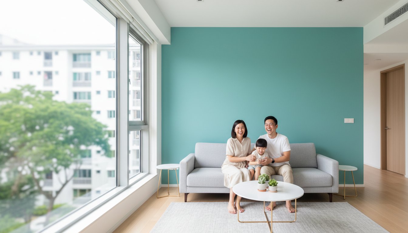
The whitest paint reflects the most light: pure white has a light reflectance value (LRV) of 100, on a scale that starts at zero for absolute black. But the brightest-looking choice for a dim room isn’t always pure white. Choosing paint colors for homes with low natural light means balancing reflectance with the room’s exposure and the mood you want.
It’s easy to assume a pale shade will look the same on every wall. In practice, window direction, nearby obstructions and the time of day affect how a colour appears. A soft neutral may feel warm in one room and cool in another.
Learn how to use LRV as a guide, when soft neutrals and a little sheen can help, and why north-, east- and west-facing rooms call for different choices. You’ll also find a practical way to test paint samples in your own space before choosing a colour.
Key Takeaways
- Use mid-tone colours as a starting point for a dim room, and consider how much depth you want before choosing a very dark shade.
- Explore warm whites, creams, greiges and other soft neutrals when pure white feels too stark or the room reads cool.
- Consider a finish with some luster to help the walls catch available light, while choosing a sheen that suits the surface.
- Tailor the colour to the room’s exposure: north-facing spaces can benefit from warmth, while west-facing rooms may shift noticeably through the day.
1. What is the most reflective paint color?
Pure white is the most reflective paint colour, with a light reflectance value (LRV) of 100. The LRV scale runs from zero for absolute black to 100 for pure white. But a high number doesn’t guarantee a brighter-looking room. Paint needs light to show its colour, and a shadowy interior can make even white walls appear dull or dingy.
For paint colors for homes with low natural light, consider mid-tones with an LRV between 20 and 60. Shades below about 15 can feel especially dark in dim rooms, while colours above 50 are a useful starting point when you want a brighter effect. Powder blue, light grey, pale rose, and soft lavender can add colour without relying on stark white.
What colors work best for north-facing rooms with limited natural light? North-facing rooms often feel cool, so warm whites, creams, beiges, tans, greiges, taupes and soft lavender can add visual warmth. Pale yellow is another option for a gentle, sunny impression rather than a crisp, cool white.
Test samples before choosing. Paint 12-inch blocks on every wall, then observe them at different times of day. Compare the same shade near a window and in a shadowed corner; the contrast shows how your room’s light affects its appearance.
In abundant natural light, very high-LRV colours can look washed out. Colours below 50 can soften a bright room, while darker shades often retain more of their character and still appear lighter than expected. Pairing chosen wall colours with tailored window styling from universalblindsuk.co.uk can also help manage glare and modulate how daylight enters. In rooms with multiple exposures, consider the overall feel and your preferences; give one direction more weight only when its light clearly dominates.
White can look dingy in a dark room because limited light makes its surface seem muted rather than crisp. To brighten the space with colour, try pale rose or light grey on the walls, or use powder blue as a cooler accent. In a dim corner, warm orange can create a cosy glow under lamps.
2. Light neutrals as alternatives to pure white
Pure white can feel stark in a dim room, while light neutrals soften the walls without making them seem heavy. Warm whites, cream, beige, tan, greige and taupe can make a north-facing interior more inviting. Their subtle undertones add warmth, and their pale surfaces reflect available light. Choose a neutral that complements fixed features such as flooring, cabinetry or timber furniture.
Are warm or cool paint colors better for dark rooms? Warm colours often suit rooms that feel cool or shadowed, especially north-facing spaces. Warm white, cream and pale yellow can counter that cool impression, while a cooler neutral may work if you prefer a cleaner, calmer look. Compare shades beside your woodwork and furnishings, since nearby colours affect the overall balance.
In an east-facing room, pale gold can catch and reflect gentle morning light. Pale yellow is another option for a sunlit impression, while warm wood tones can add depth. White woodwork creates crisp contrast without requiring every wall to be pure white. In a room with little daylight, choose a restrained yellow rather than a strong, saturated shade.
Ochre adds more depth than a pale neutral, with tones ranging from gold-like to wheat-inspired. Use it on walls with white trim, moulding or a white mantel to define the edges. Semi-gloss or high-gloss paint on woodwork adds sheen against softer ochre walls. Keep the main wall colour consistent if the room has several adjoining surfaces.
Test a warm white, a cream, and one deeper neutral beside the same trim. View each sample in the morning and later in the day; east-facing light changes after its early brightness. If you’re planning a cohesive finish for your home, explore paint planning support as a next step.

3. Choosing paint finishes with some luster
A finish with some lustre can help a low-light room make use of the light it receives. Rather than choosing a flat finish everywhere, consider where gentle highlights would help. Subtle sheen can give pale shades more definition in enclosed spaces with limited daylight. For example, a soft cream wall may look more dimensional beside a matte ceiling.
Let the room’s surfaces guide your choices. A wall finish with some lustre can catch light, while semi-gloss or high-gloss paint can distinguish woodwork, trim and moulding. In a dim living room, restrained wall sheen paired with glossier white trim creates contrast without making every surface shine. Keep the ceiling quieter if you want the wall finish to stand out.
Check the finish as well as the colour before choosing a shade. Place a sample on the wall beside the intended trim, then view it in daylight and under your usual lamps. Look from the doorway and nearby seating: a highlight that seems gentle from one angle may look stronger from another. This comparison helps you judge the overall effect.
Surface condition matters, too. Reflective finishes can make uneven patches, filled areas or wall texture more noticeable, so inspect the surface before choosing a lustrous wall coating. A smooth wall may suit subtle sheen, while a visibly uneven section may look calmer with less gloss. Use gloss selectively on sound woodwork, where a crisp edge can frame muted wall colours without overwhelming the space.
4. How exposure and natural light affect paint appearance
A paint shade does not have one fixed appearance; it changes with the light reaching each wall. Window direction and size, nearby buildings and the time of year all shape that light. A soft yellow may look warm in one room and subdued in another. Judge the colour in its actual setting, not just from a paint chip.
North-facing rooms receive cooler-feeling light, so warm yellow can make them feel more welcoming. East-facing rooms often have gentle morning light that brings out pale gold. West-facing rooms may look flat and grey in the morning, then brighter after noon. A colour that feels balanced early may appear more vivid later.
In a bright room, a colour with an LRV below 50 can help soften the overall brightness. High-LRV shades may look washed out in strong natural light, while darker colours can hold their character and still appear lighter than expected. Grey can suit both sun-filled and dim interiors, depending on its undertone and surrounding finishes. For spaces where managing excessive sun or outdoor visibility is also a priority alongside paint, residential film specialists like Sun Guard Tint offer privacy solutions that help regulate incoming daylight.
How can paint undertones look different under artificial lighting? A lamp’s colour can shift how a wall reads: warm-toned light can make yellow or beige look warmer, while cooler light can bring out blue or grey. Compare the sample under the lamps you use in the evening as well as in daylight.
If a room has windows facing more than one direction, give exposure less weight unless one side clearly dominates. Consider how the room feels throughout the day, including the effect of windows partly blocked by nearby buildings. Check the colour beside flooring and furnishings, too. These details help you choose a shade that suits the room’s changing light.
Assessing several rooms or exposures? Plan your home’s painting project around how each space receives light.
My Paint Job Singapore
My Paint Job Singapore helps turn your colour choices into a carefully finished space, with painting services for HDB flats, condos, landed homes, and commercial properties. If a dim room needs a considered combination of wall colour and finish, the team can help shape the painting work around the space and the look you want.
Careful surface preparation supports an even finish, and plastering can address wall imperfections before painting. Share which rooms feel darkest, the direction their windows face and the mood you want. This context helps guide practical choices about colour and finish while keeping the overall design in view.
Contact My Paint Job Singapore to discuss your painting project.
Let your colour choices connect the whole home
Your final choices shape how rooms feel together, not just how one wall looks. Consider the view from the hallway into a dim living area, or how a bedroom’s colour sits beside the adjoining space. A consistent palette can create flow, while a carefully chosen contrast gives a room its own character. Take this wider view to make your shortlist feel personal to your home.
If you’re planning paint colors for homes with low natural light, My Paint Job Singapore offers painting for HDB flats, condos and landed homes. Share the shades you prefer and the rooms you want to refresh, then choose a finish that suits your space.
Contact My Paint Job Singapore to discuss your painting project and take the next step toward a home that feels distinctly yours.
Frequently Asked Questions
What is the most reflective paint color?
Pure white has the highest light reflectance value, at 100. That describes its reflectance rating, not how bright every room will feel: a wall in a shadowed corridor still receives little light to reflect. If maximum reflectance is your priority, white is the clearest choice; if it feels stark, compare a softer white with your flooring and furnishings.
What paint colors make rooms with low natural light feel brighter?
Light grey, pale rose, powder blue and warm neutrals can keep walls from feeling visually heavy. Choose according to the room’s existing finishes: pale rose can soften a bedroom with dark wood, while light grey can sit quietly beside colourful artwork. A lighter wall colour won’t replace daylight, but it can help a room feel more open and balanced.
Which white paint shades work best in rooms with little sunlight?
Warm and creamy whites are useful starting points when a room feels cool or shadowed. Compare them with the room’s fixed finishes: a warm white can complement timber flooring, while a cleaner white may suit crisp white cabinetry. View samples beside the trim and furnishings, as nearby surfaces can make the same white seem warmer, cooler or more muted.
What light-reflectance value (LRV) should paint have for a low-light room?
For a dim room, use an LRV from 20 to 60 as a practical starting range for mid-tone colours. Lower values can create a deeper, more intimate effect; higher values can help a room feel brighter. Treat the number as a comparison tool, not a complete prediction. Undertone, window exposure, and surrounding surfaces also influence the finished appearance.
Should trim and ceilings be painted a different color in a dark room?
They can, but the best choice depends on the effect you want. White trim can frame ochre or muted walls, while a ceiling close to the wall colour creates a quieter, more continuous look. In a narrow passage, matching the ceiling and walls can reduce sharp visual breaks. Use contrast selectively when you want door frames or moulding to stand out.
How do paint finish and sheen affect brightness in low-light spaces?
A finish with some sheen can catch available light and create highlights, while a flatter finish keeps reflections subdued. Try the intended finish on a sample beside the wall’s trim, then view it in daylight and under your usual evening lamps. Consider surface texture, too: gloss can make uneven patches more noticeable, so reserve stronger shine for smooth surfaces or sound woodwork.